Spaces & Exhibitions
Blue Black Istanbul
Built on contrast. Rooted in denim culture. Redesigned every season.
- Place
- Istanbul
- Year
- Since 2021
- Services
- Spaces & Exhibitions
- Brand & Experience
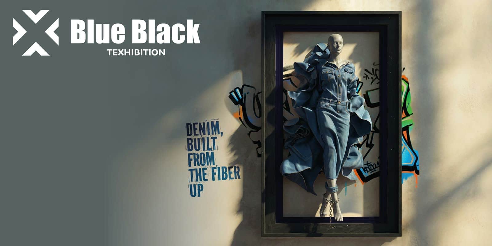
At Blue Black, we designed the space as an experience that carries the season's idea — not a surface for display. From the room to the fabric, from trend zones to events, every detail belongs to the same creative language.
Solution
For three years we have been developing a complete fair experience for Blue Black Istanbul, redesigned every season. Five seasons are already live; the sixth is in preparation.
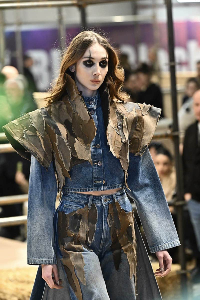
Each season begins with a new theme and covers the full experience: the hall's creative concept, the spatial plan, the trend zones, and how participating companies' fabrics are shown.
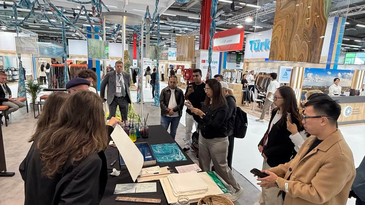
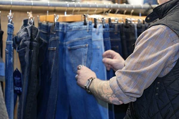
Rather than simply displaying fabrics, we fold them into the season's story — creating physical experiences where visitors can discover new trends, touch them, and leave with something to work from.
Workshop areas, DJ sets, catering, social spaces and visitor touchpoints all sit inside the same creative concept. Design, content and production come together as a single experience.
The aim is a space that renews itself every season, reflects where denim is heading, and that visitors don't merely walk through — they discover, take part in, and want to spend time in.
Outcome
Blue Black Istanbul sits within Texhibition Istanbul's international visitor and exhibitor network as a dedicated experience space for the denim world.
In the September 2025 season, Texhibition Istanbul welcomed 24,148 visitors over three days. 7,021 of them were international, with 524 exhibiting companies across five halls.
In the March 2026 season, 19,325 people visited the three-day event. 5,565 international visitors, participation from more than 95 countries, and over 500 companies made the event's global reach unmistakable.
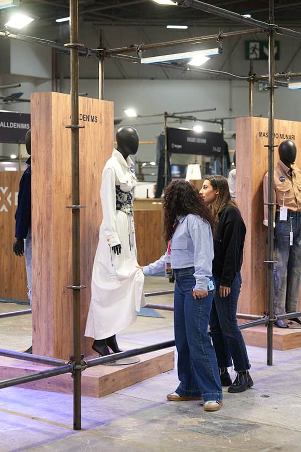
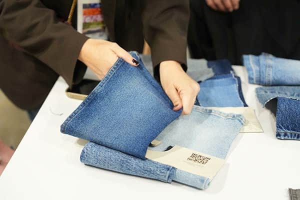
Not a space to walk through — a space to spend time in.