Brand & Experience
Blue Black Istanbul
A brand identity and spatial system built around contrast and precision.
- Place
- Istanbul
- Year
- 2026
- Services
- Brand & Experience
- Spaces & Exhibitions
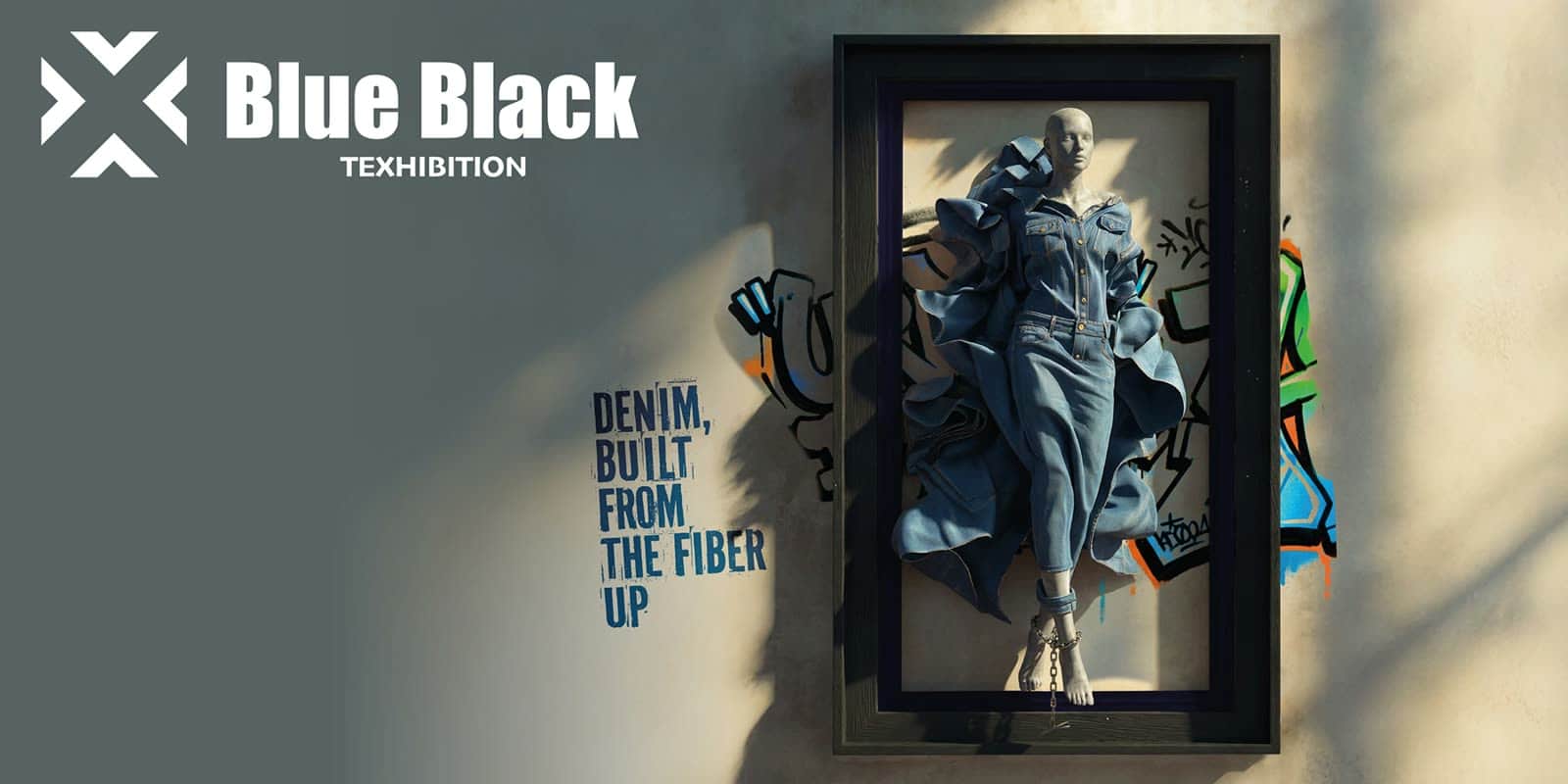
Blue Black needed a luxury identity that could move from packaging to retail floor without losing edge. We treated black and light as structural materials — not decoration — and built a system where type, finish and spatial rhythm share one set of rules.
Challenge
Luxury without softening
Define a luxury identity that could live on packaging, retail and digital without softening into a moodboard. The brand had to feel expensive in a label and decisive in a room — the same language at every scale.
Approach
Contrast as a system
We built a high-contrast system — absolute black, absolute light — and let material, type and space share the same rules. Hierarchy came from proportion and finish, not from adding more marks. Every touchpoint was designed as a cut of the same block.
Outcome
One language, every scale
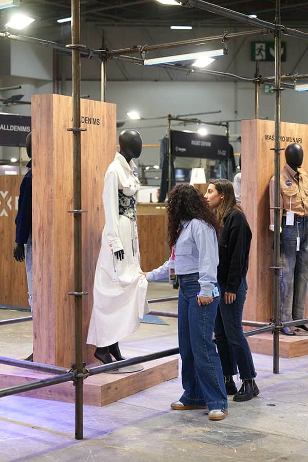
A coherent brand and spatial language that reads as intentional at every scale, from a label to a room. The identity holds under pressure: retail lighting, digital compression and packaging constraints all speak the same dialect.

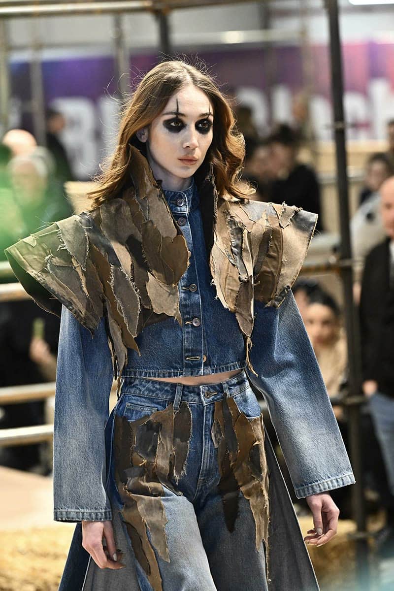
Contrast is not a look — it is the operating system.
Blue Black Istanbul